To create great artwork or cartography requires some things.
You need tools or programs you can use. Like a pencil, or ArtRage 5.
Some skill. It doesn’t have to be a university level degree.
A basic understanding of physics (such as light and shadow). For example, the same light can’t hit both sides of a roof unless it’s top-down without some variation.
Time. Don’t rush it.
That last one. Yeh, time.
There’s a simple equation to the positive reactions elicited from the final creation of a piece of cartography and artwork. And it’s the most important one.
(I’m clever, me).
Like Shoeless Joe Jackson said, “Build it, and they will come”.
He didn’t say, “Take your time to build it, and they will come.” I did, and I stick by it.
There’s lots of way to save time, like copying and pasting the same icon repeatedly. But it stands out like a sore thumb in most cases and messes with the suspension of disbelief. You don’t tend to have that luxury when drawing traditionally by hand anyway — unless you have a tendency to stipple (which I do) and have access to a Cuttleola Dotspen.
Do I use shortcuts, hell yes — sometimes, but I try to make them as difficult to spot as possible with hue variations, random rotations, slight scale adjustments, etc. Generally speaking, if you look for shortcuts you undermine the wow factor.
The first step is don’t rush it, don’t try and make a self-imposed deadline. Tackle it in stages if it’s looking like a bigger job.
If you spend ALL DAY (8 hours) drawing a map it will look really nice. If you spend 5 days (8 hours a day) it will look fabulous.
Try it. Let go of time as a limitation. It’s probably holding you back.
This is a short tutorial to help show the various stages I tend to use to make colour art. I used ArtRage 5 for this, but you could just as easily use Photoshop or Gimp as the terms used are generally common.
Hey, I’m a GIF…
So, let’s start.
Stage 1 – Line Art
Create a layer, call it Stage 1. Create a simple outline of the piece on that layer. Easy.
Stage 2 – Base Colour
Create another layer (Stage 2) underneath the Stage 1 layer. Select a colour. Grey in this case, and colour it in.
Stage 3 – Dark Textures
Create another layer (Stage 3) between Stage 1 and 2’s layers.
I select the Stage 2 layer, then use the magic wand to select the whole of the Stage 2 layer. Then with the selection highlighted, select the Stage 3 layer. This gives me a good boundary for the texture without needing to tidy up after.
I have a couple of textures I use for this, but use what you can find which you think might look good. I then select a darker shade of the base colour, maybe even some green for lichen effect, and dab it on.
Stage 4 – Light Textures
Create another layer (Stage 4) on top of Stage 3’s layer.
Basically, the same as the work we did on Stage 3 layer, but we use a lighter shade of the base colour, or white spots or something.
Stage 5 – Shadows
Create a new layer (Stage 5). This can be anywhere. Set the layer to Multiply, and opacity to around 50%. Use black as your colour.
Decide where the light is coming from (and stick to it going forward), and then start adding shadow to areas that would be in shadow from the light source position.
Stage 6 – Highlights
Create a new layer (Stage 6). This can be anywhere. Set the layer to Overlay, and opacity to around 50%. Use white as your colour.
Based on where the light was coming from in Stage 5, start adding highlights to all edges and faces that would receive highlight from the light source position.
Stage 7 – Engraving
Okay, let’s get funky.
Create a new layer (Stage 7), and it can go on top of all the other layers. Set it to Multiply. Use the base colour from Stage 2, and using a pen type brush write your engraving on the art.
Then we need to apply some layer effects. You will want Emboss (inside). You will need to adjust the light position, so that it correctly follows the light source decision you made in Stage 5/6.
Stage 8 – A bit of extra detail
Back to the Stage 1 layer and add some extra bits and bots for good luck.
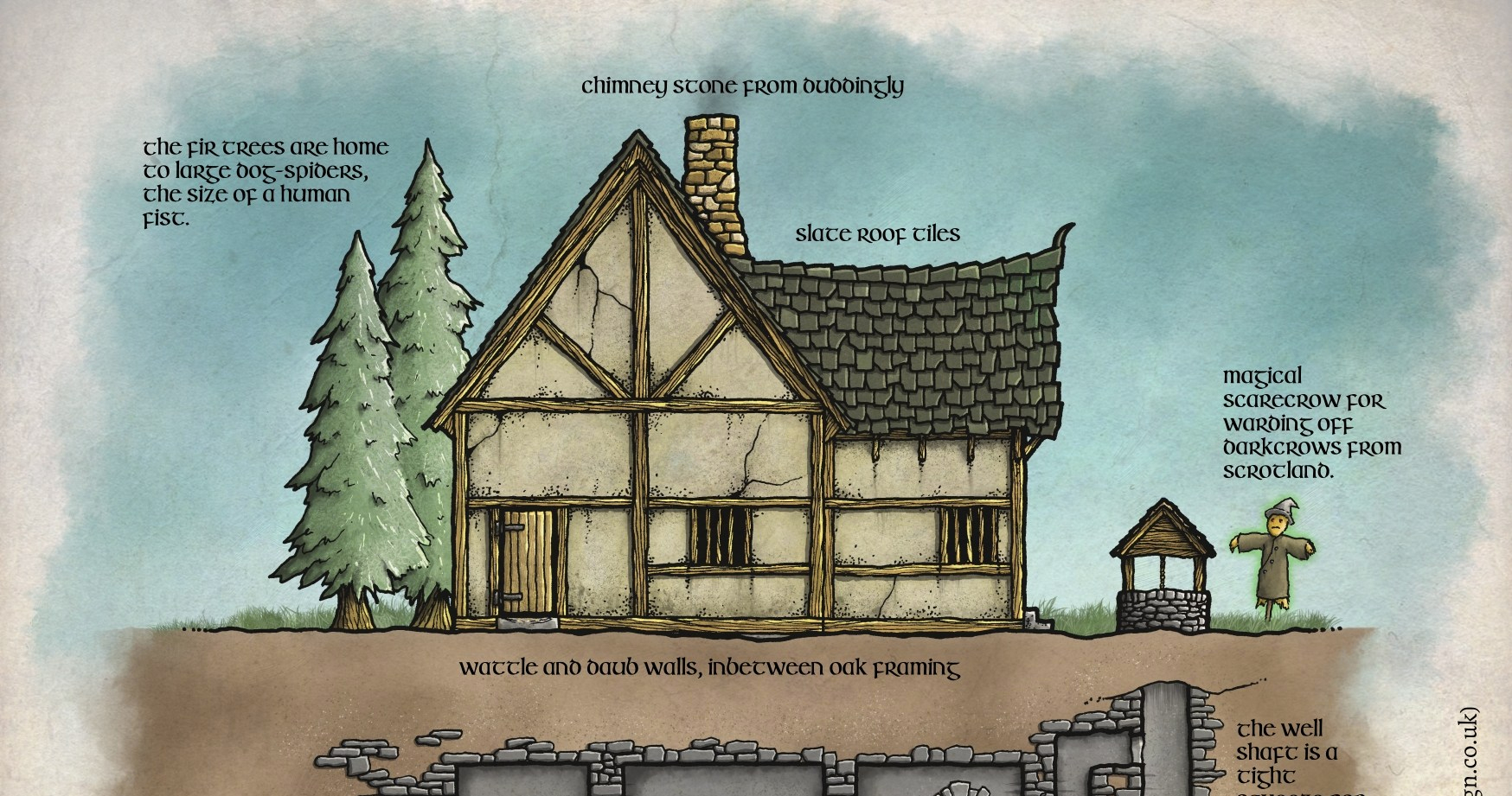
The Wyrmere has provided for the community known as Sheepfeld for over fifty years. A gathering of the livestock farmers — mainly sheep — the folk have become unwelcoming of late. Tall tales of giant sheepmen stalking the woods at night craving blood have spooked many from visiting the area and the supply of fleeces to the towns up the trade route has now stopped.
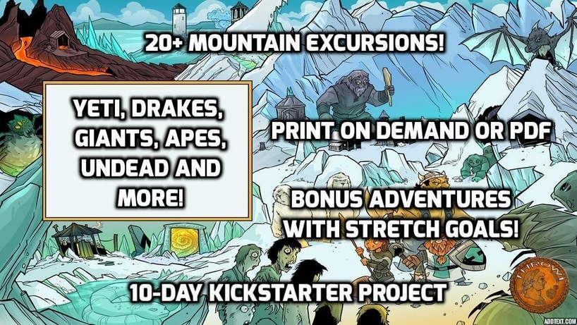
The industrious Thom Wilson at Throwigames is back with another of his fabulous ‘Excursions’ Kickstarters. This time it’s Mountain Excursions.
It’s only a short KS and already funded, so don’t miss out on it.
I will be helping the project along with map upgrades. I’ve done some already, and hopefully more to come as the days unfold. Check out the project here:
To be clear, I’m talking about the ability. I’ve been listening to Erik over at the Tenkar’s Tavern blog and his ‘Designers and Makers’ slot got me thinking…
As a player, I hate Save or Die. Nothing says ‘kill my fucking fun’ like Save or Die. I know why too. I like to keep a character and gain experience to build them up over time, to feel attached. That’s how I played as a kid — I had characters that were crazy multi-classed, +6 Hellblade-wielding, Archdevil-slayers. I remember being 14 and losing a character to a pretty angry Mephistopheles and I was fucking miserable for a couple of days.
If you think about it, things like Flesh to Stone or Petrification are the same thing. It’s pretty much death, although with enough high-level magic you can get round it. The same with Save or Die — it’s get roundable. But it contains the word Death. And that sounds bad and final.
“You’ve been a very naughty Lich, killing all those PCs like that.”
Using Save or Die — or any other ‘single dice roll and probably get a new character sheet’ mechanic — should be used with caution. It’s group and player-dependent. It’s campaign-dependent. If you are planning to use it, then players should know in advance of the session where it may crop up. Players get complacent, but killing a character they have played for 20 sessions (with no backup plan to reverse it) is a dick move, and I can bet that player WILL NOT think it’s a good game. Remember, you are playing for fun after all.
NOOOOOOO!!!!!!
In one-shots and convention games I can see how this is appropriate. But leave that mechanic/’save or die’ boss until near the end. It’s shit dying at the start of a session. Of course, if you have a group of players that are fine with getting characters killed off, then feel free.
‘As Gary Intended…’ doesn’t mean kill anyone who’s stoopid. After all, M0rdenkain3n, Ten5er, Bi8by, Le0mund and all those guys survived into adulthood and legend.
For campaign play, ‘single roll and it’s game over’ situations really kill the fun. There still needs to be perceived risk and threat though, as strolling through adventures on easy is no fun either (for some).
The Computer Game Difficulty Model
Computer games have Easy, Normal and Hard modes very often, even Insane modes. It’s worth thinking about writing adventures with these three modes in mind.
So, here’s a thought.
When campaign playing, anything that has an insta-kill outcome would get extra save chances. So let’s say we have a room with a Medusa. The players wander in and all make saving throws.
The saving throws have a number of roll chances equal to the Difficulty Level.
So,
Easy = 3 chances at Saving Throw (You are your god’s new play thing)
Normal = 2 chances at Saving Throw (The gods smile upon you)
Hard = 1 chance at Saving Throw (Hey, God! Where are you?)
Insane = 1 chance at Saving Throw at -1d6 (Even your god hates you)
This could work for any saving throws, or situations where death is the result. It’s a kind of Advantage mechanic, but it’s fixed for certain situations.
As always, these can be specific to each player too. So if Bob wants to play on Easy, but Roger on Insane then balance that with additional XP at the end of the session.
So,
Easy = 75% of XP earned.
Normal = 100% of XP earned.
Hard = 110% of XP earned.
Insane = 150% of XP earned.
Had I have had this in my games as a 14 year old, then my wizard would have not been Mephistopheles’ plaything for eternity. May the pit fiends be merciful to his bum-hole and use foam pitchforks (yeh right).
So, some of you may remember that Venger Satanis and I were working on one last project together, and most of the pre-design for the layout had been done already when the decision was made.
It’s just released on Kickstarter. Check out Cha’alt.
From early discussions with Venger, and all the work done on the design, this one felt different. More serious. Irrespective of what you think about Venger’s online persona, his writing is evocative, imaginative, and often humorous. I think this Kickstarter will show what Venger is capable of when not immersed in the sleazy sci-fi worlds of boobs and codpieces.
The artwork for this is another level. Have you seen those Yannick Bouchard pieces? Yannick does a lot of LotFP art – he’s a master at his craft.
I am due for layout and cartography work on the project and will do my very best to ensure it meets the high expectations that you all deserve. As a fitting end to my time working with Venger, I think this product is the one to do it with — this will be his Magnus Opus to date. I will put my heart and soul into it, as I do with everything I do.
I used to be able to work out Thac0. In my head. Without using fingers or thinking out loud.
Did you ever have another player that thought it was a competition to work it out for you and say it first…? Maybe you still have that player… What a cock-womble.
Anyway, when I was at school, you never mentioned that you played D&D and its ilk. It was an invite to get the shit kicked out of you and be tormented relentlessly for your remaining school years.
Things have changed. It’s cool to be a geek or a nerd, and for that I am thankful. So thankful, that I made a t-shirt to remember the torment suffered by us all during those early years.
Wear it with pride, pioneer. You’ve damned-well earned that right to be a hero, and fought the battles that allowed these whipper-snappers to play ridicule-free.
Doug Cole is the mastermind behind Gaming Ballistic, and is an all-round great guy. You can often find him getting kidnapped into online chats with Matt Finch over on Uncle Matt’s RPG Studio.
Lost Hall of Tyr (2nd Edition) is a mini-setting and adventure for the Dragon Heresy Roleplaying game. Dragon Heresy is a self-contained complete game in one volume, and the Introductory Set covers Level 1-5.
Lost Hall of Tyr (2nd Edition) contains
A non-linear adventure for 4-7 characters of Level 1-5
A detailed workup of the Viking-inspired town of Isfjall, suitable as either a home port for an extended campaign or a jumping off point for the adventure
Rules for overland journeys in the wild north, several adventuring locations, and of course the quest to rediscover the Lost Hall itself
A bestiary containing all the key creatures from the adventure, including the Dragon Heresy unique stats pre-calculated (Threat DC, Hit DC, wound and control thresholds, wounds, and vigor)
Lost Hall of Tyr is 112 pages long, in full color.
The main maps are already completed, as they were done as part of the GURPS Dungeon Fantasy, Hall of Judgment version done by me. Here’s one showing the region, and also the Rival Claim encounter location, just across from the Rope Bridge:
Rival Claim
So, let’s take a look at the first map, Rival Claim. In the GURPS Dungeon Fantasy, Hall of Judgment version, it looks like this:
Rival Claim encounter map in Hall of Judgment
So, the brief was to create an encounter map that was easier to read, and also show the trees and trail leading north, and also the rope bridge to the south. Here’s my rough sketch:
The rope bridge was a little too wide, so I narrowed it in the final. I used ArtRage 5 for this mainly. The final labelling and scale bar/compass was added in Photoshop CC 2019.
A photo of my screen, prior to labels, scale and compass
The stones and trees were created separately as ‘sticker sheets’. I then used a sticker spray brush to place them with a slight variation to the rotation, hue, and scale. I then went back and added consistent highlight and shadow to each element.
And this is the low resolution version of the final map. It came out pretty well.
So, not necessarily RPG-related… but it kind of is. I watched the Oscar-winning The Shape of Water yesterday, having only the vaguest premise about what the film was about.
There was a unsubtle hint of green in the art direction — from the bad dude’s sweets to the jelly, the decor, the pies, almost everything. I thought about how a common colour theme really made the film seem sumptuous… It was like a 50’s, wet, fish-p0rn version of #themidderlands — obviously.
Anyway, for any of the my RPG friends that are wondering about watching it…